Showing posts with label COVID-19. Show all posts

Friday, September 25, 2020

Inspired by the industry response

Many of our posts on the blog this year have been about the pandemic, predicting its course and interpreting reported data for cases and deaths.  

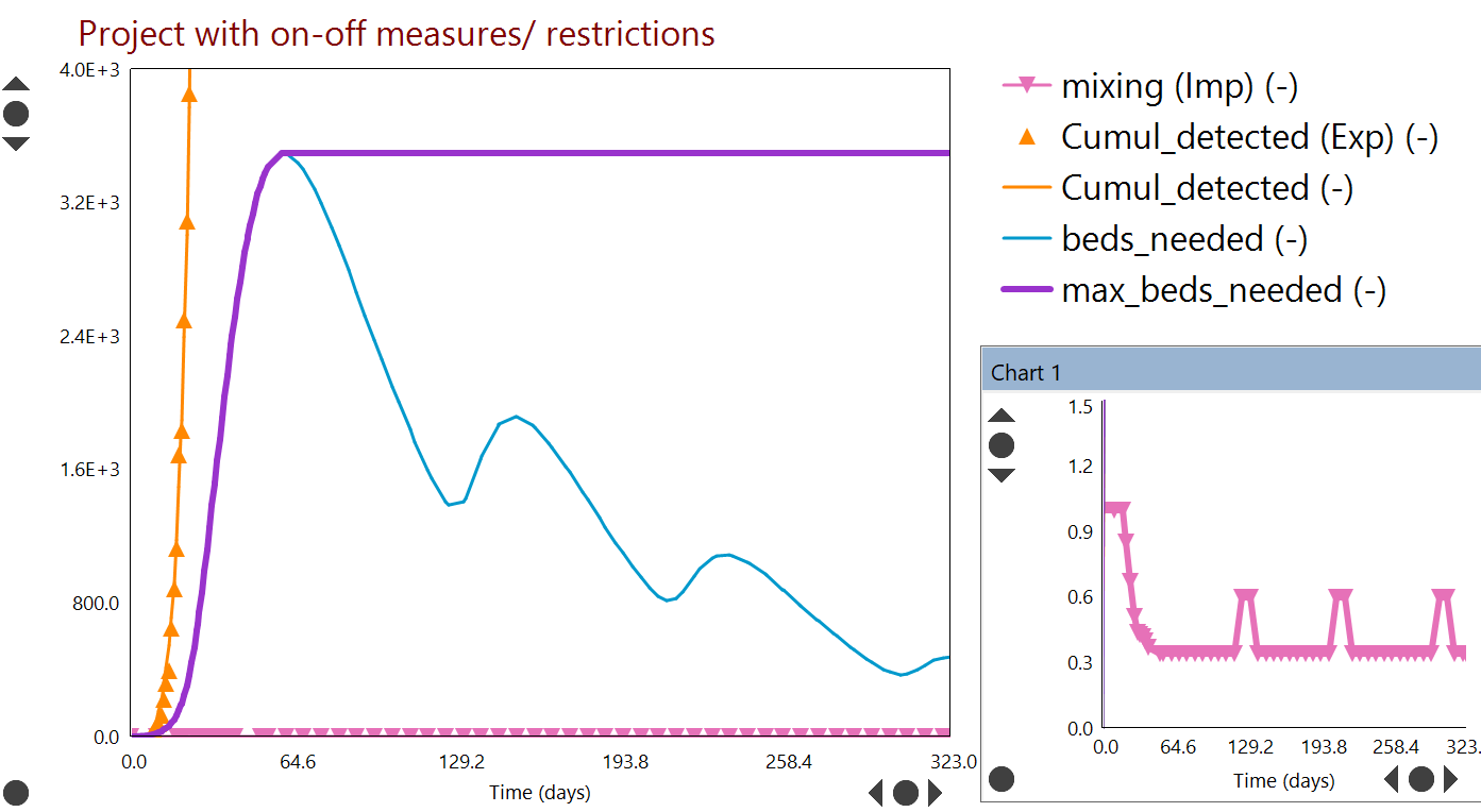
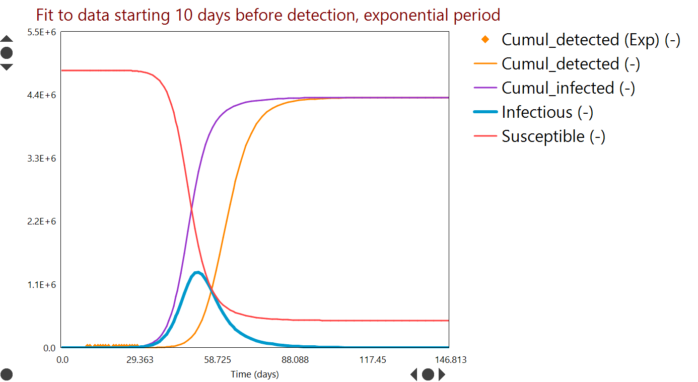
We have seen that population level Dynochem models have been sufficiently accurate to describe the data for each country and quantify the potential future impact of the outbreak as well as the effectiveness of non-pharmaceutical measures, such as lockdowns and the wearing of masks.  

Our models for the outbreak will remain available to the user community on our COVID site.  We do not plan to further develop or update the models for the foreseeable future.  

New content on the blog will return to our core focus, positively impacting the development of medicines by our customers, the global pharmaceutical industry.  

We are proud to serve the pharmaceutical industry, supporting daily core business activities at more than 100 organizations that develop or make medicines. The industry response to COVID-19 has been inspiring and no less than we expected, having worked with some of these companies for two decades.

All of our normal activities including software development, user support and training have continued in a fully operational state and we have seen increased activity from customers both using and learning the tools. Of course we are delivering all events on-line for now. Public training events are half price during the outbreak and we have been offering training licenses to customers delivering their own internal curriculum.

We have ramped up our own support for unit operations likely to be involved in manufacturing vaccines and treatments, including bioreactors and lyophilization.

We would be delighted to hear from members of the community anytime if you have ideas or suggestions as to how we could do more, by email to support@scale-up.com.

Reaction Lab in action
Our Reaction Lab software helps chemists develop kinetic models, maximize yield and minimize impurities.

Thursday, July 23, 2020

COVID-19 models including reopening and second wave

Reopening of many countries has begun and testing rates have also ramped up.  Some countries are now better able to detect infections and the age profile of infected people has in many cases shifted towards younger people.  Some countries have the outbreak under good apparent control while others have not yet seen even the first peak.  

We have updated our models for Ireland, the US and Italy to include the latest ECDC data.  On the basis of our modeling assumptions, and in the absence of further closures/ measures, Italy may not see a second wave for a considerable period.  Ireland may see this second wave sooner (and authorities will act to control it).  

A population (whole country) based model of any country is an approximation, as there are always localized effects, especially when applied to large countries like the US.  For example, cities in the North East had large first waves and are having relatively small second waves on reopening.  Cities in other regions had small first waves that never really fell away and are now seeing the effects of those waves continuing to build after somewhat earlier reopening.  Viewed as a whole, the US clearly has a second wave, but for the above reasons that terminology is not necessarily accurate locally.

Model fit to death rates in the US as a whole, up to 23 July 2020.  Model predictions indicate that a second peak in death rate has started and tightening of measures is required to limit its severity.

We have included in the latest models parameters to reflect increased detection by testing (as positive test rates are reducing in many nations) and also reduced mortality as the age profile shifts.  Those extra parameters add uncertainty but are necessary in order to continue to describe the evolving situation well.  On the basis of the model and its prior versions referenced in previous posts, parts of the US will need to continue to take all possible measures to limit the spread of COVID-19 in order to prevent a significantly larger death toll.

Sunday, June 14, 2020

COVID-19 second wave risk: models for Ireland, Italy, US and Singapore

We've taken another look at ECDC data to date and updated the models for the US, Italy and Ireland with data to 13 June.  We've also added a model fitted to Singapore data.

To date, the same model structure has fitted every region and inferred rates of physical contact between those infected with the disease and the broader community have tallied qualitatively with mobility data from Apple and Google.  That continues to be true for Ireland, Italy and the United States.  

Now that many countries are easing restrictions, the risk of a second wave of infections is growing.  In the case of the US, model parameters are tending to suggest that a second wave could be nearer than in the other regions.  Every feasible way to reduce transmission should be considered and it is possible that relatively small measures such as widespread wearing of masks could make the difference between a manageable and unmanageable second wave.

We've added some factors to the scenarios tabs of the models that define how restrictions are lifted.  That makes it easier for you to change those (in Simulator>Set Parameters) and you can use them to make response surfaces.  We took Ireland as an example and estimated the number of reported deaths at end 2020 for a variety of 'new normal' levels of contact (m_normal) and periods over which we adjust from lockdown to those levels (t_normal).  
Response surface (contour plot) for projected Year End 2020 reported deaths in Ireland from COVID-19, as a function of 'new normal' levels of movement / transmission (m_normal) relative to baseline and the length of time over which we move from lockdown to new normal (t_normal).  While there is some sensitivity to t_normal, the main sensitivity is to m_normal (vertical axis).  Every reasonable step should be taken to keep this value as low as possible.
Here's hoping that our greater knowledge about COVID-19 puts us in a position to avoid the less favourable regions on this diagram.

We added the Singapore model at the request of a customer there.  Singapore was highly praised in the early stages of the outbreak, with a small number of cases, extensive testing and vigilance and a very low mortality rate from COVID-19.  However an outbreak in dormitories used by migrant workers led to a spike in cases and a period of lockdown referred to as the 'circuit breaker'.  Mortality rates remain low and this is attributed to both compliance and the young age profile of the majority of cases / migrant workers.  To fit the data, we had to allow for a burst of increased contact (the breakout in dormitories) and the model now fits the data well.

All models are available here as usual.  All you need to run them is the Excel file and Dynochem.

Sunday, May 10, 2020

COVID-19 exit strategies from lockdown

We have been using a 'mixing' variable to represent the effects of non-pharmaceutical measures / interventions on the rate of exposure to COVID-19:
The rate of change of the number of people currently exposed depends on i) the relative contact rate between infectious and susceptible and ii) the probability of transmission during contact; these are reflected together in the 'mixing' term
This parameter reflects the relative contact rate between infectious and susceptible and also the probability of transmission during contact.  Baseline mixing = 1.0, i.e. what we did before the outbreak.  To date, this variable has been reduced by lockdowns and closures (reducing our contact rate) and physical distancing, handwashing, mask wearing (reducing the probability of transmission).  When we are exiting lockdowns, our contact rate will return gradually towards the baseline but if we maintain or improve current standards of physical distancing, handwashing and mask wearing, the mixing term in the model will not return to 1.0.  This will be very important in preventing large subsequent waves of infection.

As noted in last week's update, Ireland, Italy and the United States have reduced infection rates during lockdown by at least two thirds.  Some of the benefit came from reduced contact and some from reduced probability of infection; at this time it is difficult to split the effects accurately; however it is likely that the reduced probability accounts for a significant portion of the effect.

In addition to including the latest data in our models this week, we have updated the lines (on the process worksheet) that allow simulation of the effect of relaxing the measures that reduced contact.  Most countries will relax measures over a period of several months starting soon, while maintaining focus on hygiene and distancing and in many cases encouraging the wearing of masks.  Our models currently simulate a linear relaxation of measures, though in practice these will occur in 'steps' or 'phases'.  We also include the option of a return to current lockdown for a short period at any time.  Users can define the ultimate 'relaxed' value of the mixing variable and to begin with we have set this to 45% of baseline.  We chose this value in the hope that measures affecting probability of transmission will be maintained and that they are highly effective; and that as many people as possible will be able to continue to work from home.

Example projections are shown below for the US as a whole, with linear relaxation of lockdown measures to mixing = 45% of baseline (inset) over a period of months.  Even with these potentially optimistic parameter values, a very large second wave of infections could occur before the end of the year.  It seems likely therefore that in order to control the level of infection, it will be necessary to have periods during which we return to current levels of lockdown.
Model fit to known cases and reported deaths to date for the US (symbols and curves of the same colour).  Then projecting to end 2020 with a linear relaxation of restrictions on movement [inset], to a new stable mixing level of 45%.

Sunday, May 3, 2020

COVID-19 models at 3 May Ireland Italy and US

Our models have been updated to include the data from Ireland, Italy and the US for the week just ended.  Trends and parameters are stable in all regions.  We do not adjust R0 in any region (this was fitted to the early 'exponential' data) but we refit the 'mixing' profiles each week and values have been steady for some time.  Since 11 April, the models also predict death rates and the related fitted parameters are also steady.

Of the three regions, R0 may have been highest in the US (3.92) and lowest in Italy (2.94), with Ireland in between (3.52).  We estimate that R_effective (or Rt) after adoption of restrictions is now 1.1 in the US, 0.98 in Italy and 0.84 in Ireland.  These figures translate to mixing levels of 28%, 33% and 24% of baseline respectively in the periods of most severe 'lockdown'.

In order to predict the safest and most beneficial ways to release restrictions, data on the incremental effectiveness of each separate measure (e.g. social distancing, wearing masks, cocooning the vulnerable, staying at home, closing shops and places of work) would be extremely useful but are not yet available.  We may learn these parameters as the outbreak progresses and be better able to predict exit strategies.

In the meantime, Google and Apple are providing anonymized data related to movement, recorded when our devices talk to their servers.  In general, these data trend in line with the mixing percentages we estimate from the predictive model.  Results are shown below for the United States as an example. Though the mobility data are scattered, the trends align with the predictive model and indicate that mobility data are helpful indicators of progress.

Mobility data from Apple devices compared to the mixing variable fitted to COVID-19 case data for the US.  Though the data are scattered, the trends align with the predictive model.

Sunday, April 26, 2020

COVID-19 models at 26 April Ireland Italy and US

Our predictive models for Ireland, Italy and the US are stable and identical for each region, differing only in fitted parameter values (e.g. R0 and people movement versus time).  As the progress of COVID-19 is slowed by restrictions, the fitted parameter values for people movement have become more consistent from week to week.  Models with data to 26 April 2020 are available here as usual.
Good progress is being made and restrictions will be gradually loosened and occasionally re-tightened over the coming weeks and months, depending on trends in case numbers. 

Data for Ireland remains harder to interpret because of delayed testing results and some changes in the basis for reporting deaths this week.  A graph showing backdating of rest results was shared by the government on 23 April 2020 and we have used this to update the Ireland model; however there are spurious peaks (see below) and in addition, focused testing in care/nursing homes generated high case numbers this week that probably do not reflect a trend.  We therefore did not do a tight fit to the Ireland data.
Known case data for Ireland reported by the ECDC and a backdated version of the same information published on Thursday this week.  Both versions contain spurious trends that make direct use for parameter estimation difficult.
Approximate model fitted to backdated Ireland data indicates that the number of infectious in the first wave probably peaked around 1 April 2020.
Over the next weeks we will explore developing a more granular predictive model for the loosening of restrictions, especially focusing on the degree to which communities can return towards normality while those especially vulnerable remain protected. 

Sunday, April 19, 2020

COVID-19 at 19 April Ireland Italy and US

Each of the regions we have been modeling continues to make good progress against COVID-19 and some relaxation of the restrictions on people movement are being discussed or applied carefully with a view to avoiding second and later waves.

The numbers of infectious appear to have peaked clearly in Italy and the US.  The Ireland data has been harder to read because of around 3000 positive test results delivered three weeks late;  without a definitive restatement of the correct dates for those case numbers, it is difficult to be confident of the Ireland parameters at this time.

Models with current data are available as usual here.  Sample results are shown below.  As usual in the graphs below, discrete symbols are measured data (cases and deaths) and curves of the same colour are model predictions of those data.

Italy:

Predictive model fit to known cases and reported deaths from Italy indicates a peak in the number of infectious in mid March.

US:

Predictive model fit to known cases and reported deaths from Italy indicates a peak in the number of infectious at end March.

Sunday, April 12, 2020

COVID-19 models for Ireland, Italy and US - 11 April

Thanks again for all the positive feedback on this work.

In this week's update we have included data to 11 April for each region.  The structure of the predictive model is the same as before, with the additional calculation of deaths from the outbreak now included.  We have also simplified and we hope improved the workflow for application to other regions, by replacing the manual adjustment of an 'imposed' population mixing profile with use of the Dynochem Fitting window to fit a 'piecewise-linear' mixing profile to all case data (second scenario in the model).

The models (available here) fit very well to both cases and deaths in each region (first scenario for initial period and second for the outbreak to date).  The now usual caveats apply about known coronavirus case numbers: they lag and obscure real case numbers and their meaning varies depending on the testing criteria, volume and delay in each region and over time. Case data for Ireland has been muddled in recent days by the addition of results from swabs taken over the last month that took several weeks to test; we have attempted to reconcile this unhelpful number over the relevant period and refitted parameters for Ireland on that basis.

Each region's degree of control over the outbreak may be assessed by the current effective 'R', taking account of its original value (R0) and the restrictions.  R_effective should be near or preferably below 1 before restrictions can be safely relaxed for a short period (when it will rise).

The are many 'peaks' in such an outbreak and to say 'it has peaked' requires a more specific definition of the type of peak.  While infection rate may already have peaked (in the first wave), detection lags that, so peaks later; death rates also lag and peak later again.

Various peaks that occur in an outbreak like COVID-19, using model data for Ireland as an example.  Natural time lags as well as testing delays may cause peaks in infection, detection, death (on secondary y-axis) and ICU bed occupation rates to occur at different times.

As usual in the graphs below, discrete symbols are measured data (cases and deaths) and curves of the same colour are model predictions of those data.  'Mixing' reflects the reduced interaction of the population with each other.

Ireland:

Ireland: Including the burst of old case data results received this week, Ireland looks to have a little further to go before the first wave of the outbreak places peak demand on health services.  In order to bring that peak into April, the public will need to observe restrictions more tightly than at present.  Estimated current R_effective=1.1.  The peak infection rate may have occurred around 3 April.

Italy:

Italy: The first wave of the outbreak has recently passed the point of peak demand on health services. Peak infection rate was probably around 19 March. Estimated current R_effective=0.97.

United States (as a whole):

US: Peak infection rate may have occurred in early April.  Peak demand on the health services could be in late April or early May.  R_effective appears similar to Ireland at approximately 1.1.

Saturday, April 4, 2020

Coronavirus projections for Ireland, Italy and US

It is generally accepted that reported / known COVID-19 cases represent only a fraction of real cases; we continue to adopt a figure of about 22% known cases cumulatively for the outbreak as a whole.  Reported case numbers also depend on the criteria for testing, the volume of tests, the time taken to produce a test result and test accuracy;  all of these factors are in flux to some degree in most regions.  However known case data remains the best information that we have to assess the state of the outbreak and we continue to use those data in the models today.

Our model 3 (available here) tracks the population and predicts the numbers who have been exposed, infected, isolated and cured; it combines the (testing) time lag of detection relative to infection that we used in model 1, with the 22% cumulative detection rate we used in model 2 and represents a small evolution that we think improves it's correspondence with reality.  We see this as a fit for purpose model and future postings are unlikely to change the model much, only to apply it to the latest data.

Results to date and projected to the end of 2020 are summarized below for Ireland, Italy and the United States.  Projections support the view that the month of April may see a peak in demand for ICU beds in each of those regions if the current restrictions are maintained and observed by the public.  Note that in each case, the estimated number of ICU beds needed is based on the number of known cases currently in isolation and assumes that 5% of those require an ICU bed.

The question of how to emerge from the pandemic is difficult, with indications that general restrictions similar to those currently in place cannot be relaxed much for the foreseeable future.  As usual in the plots, discrete symbols like 🔺indicate measured / real reported case data (denoted in the legend as 'Exp' for 'experimentally measured') and curves indicate model predictions.  When curves pass through symbols of the same colour, the model agrees well with measured data.  The 'mixing' variable [inset] is an indicator of the extent of people movement, with 1.0 as the base case (before restrictions) and lower values after restrictions have taken effect.

Ireland:

Ireland: If current restrictions remain in place [inset] and are observed by the public, the model suggests that peak ICU demand will be reached around day 63, between 20-27 April.  Relaxation of restrictions [inset] will lead to further peaks later in the year.

Italy:

Italy: If current restrictions remain in place [inset] and are observed by the public, the model suggests that peak ICU demand will be reached near day 61, around 13 April.  Relaxation of restrictions [inset] will lead to further peaks later in the year.

Unites States (as a whole):

United States: If current restrictions remain in place [inset] and are observed by the public, the model suggests that peak ICU demand will be reached around day 93, between 20-27 April.  Relaxation of restrictions [inset] will lead to further peaks later in the year.

Saturday, March 28, 2020

Coronavirus projections: model 2

Thanks for the positive response to our initial work on a COVID-19 prediction model.  Here are the results of a second iteration in model development.  If you are a Dynochem user, you can also download and run the model from our COVID-19 site.

A challenge with predictions for the outbreak is that we only have reported/ known case data for parameter estimation.  The first model assumed that all infected cases would ultimately be known cases and that detected cases were equivalent to reported known case data.  In our updated model today, detected cases are no longer simply a lag of infected cases but use the fact that a significant portion of infected cases are never reported in known case data.

The fraction that defines this relationship was estimated in recently published analysis of the outbreak in China; using a complex model that included movement between Chinese cities, known cases were estimated to represent only 14% of the total; however they also estimate that the ability to transmit the disease in unknown cases was 55% of that in known cases.  It is difficult to see why an unknown case would be less infectious.  If we assume that all infectious are equally infectious (on average) whether their case is known or not, this leads to an estimate that about 22% of cases are known based on the China data.  We have also taken estimates of the incubation period and infectious period from the China data.

To account for the above treatment of known cases for parameter estimation, the predictive model now includes the following elements:
This is similar to what is known as the SEIR model, except that here the 'Recovered' compartment is split into Isolated and Cured, for the purposes of estimating ICU capacity requirements. We have not included mortality calculations. The concept of known cases (cumul_detected) is linked to the number of infected by the above fraction (test_frac=22%) and the time from test request to test result.  The 5% requirement for ICU beds is 5% of known cases.  Model assumptions are noted on the Process Scheme worksheet together with some notes about possible future changes.  The model includes a Notes tab explaining how to apply it to a specific region.

We have applied the model to both Ireland and Italy today and results are shown below.
Model 2 fit for Ireland data, with timeframe to end March 2020 (Day 0 = February 20).
Curves are model predictions and symbols are observed data.  Plot units are in brackets on the legend.
There is a clear indication of how measures have changed the trend in the numbers Exposed and Infectious.
Potential impact of on/off restrictions in movement for Ireland to end December 2020.  With further limits on people movement [inset], peak ICU needs could be reached in April or June, depending on restrictions.
The (future) predictions in both cases for Ireland and Italy are optimistic in that they assume a further tightening or increased effectiveness of social distancing / restrictions, compared to what we have been able to achieve to date, plus repeated application of those measures for months ahead. There is evidence that Italy has reduced contact to 40% of base level, while Ireland has reduced contact to 50% to date; these levels are indicated by the 'mixing' variable in the model (see inset plots).  The economic and other costs associated with continuation and deepening this regimen (e.g. to 20% or 10% contact) may not be sustainable.  To generate additional predictions with alternative timing and extent of measures, download the model and run this scenario with your own inputs.
Model fit for Italy data, with timeframe to end March 2020 (Day 0 = February 12).
Curves are model predictions and symbols are observed data.  Plot units are in brackets on the legend.
Potential impact of on/off restrictions in movement for Italy to December 2020.  With further limits on people movement [inset], peak ICU needs could be reached around the end of April (day 77 for Italy).  Relaxation of restrictions even for a short period could return demand towards peak levels.
To drill down further and run your own scenarios, download the model and run it.

In addition to challenges interpreting known case data, the number of data available are also limited, therefore model parameters are uncertain and predictions are indicative only.  In particular, the R0 parameter we obtain by parameter estimation to known case data is 3.0 for Italy and 3.55 for Ireland, both higher than values generally quoted for China.  This could reflect differences in social contact patterns, age profile or the importation of cases due to air travel, which are not explicitly included in our model.  Both values being higher than China may be an artifact of having too few data at present and makes the current model predict more severe impacts.

Monday, March 23, 2020

Coronavirus projections

We built a model over the last week using our Dynochem platform that analyzes reported case numbers and projects forward to the peak(s) of the outbreak, allowing interactive exploration of the effectiveness and timing of measures that could be implemented.  This model may be applied to the specific situation in any country or region, by fitting two parameters to case data for that region from the ECDC. You can get a copy of the model here; to run it, you'll need Dynochem installed.  In recent days some nice online simulators have also appeared and here is one example.

The current Dynochem model tracks the number of susceptible, infectious, isolated and cured patients versus time.  Detected cases are tracked, with a time lag after infection that reflects both the induction period and rate of testing.  The rate of growth is fitted to regional data for detections (cumulative).
Schematic of current Dynochem model for Covid 19 outbreak [click to expand]
The effect of reduced movement/ contact of citizens is included as a mixing parameter, ranging from 1.0 with free movement to 0.0 with no movement at all.  [Because infection behaves like an un-premixed chemical reaction, classical chemical engineering concepts like intensity of segregation are relevant and the rate of reaction depends quite linearly on the number of infectious people that are moving around/ mixing.]

The Dynochem model assumes that all detected cases are isolated after detection and are no longer able to infect others; this is the current policy of health authorities.  However the number of actual infected cases in the early period can be many times more than those detected, so most of the infectious may be moving through the community when no restrictions are in place.

Parameters estimated from case data are i) the initial number of infectious cases 10 days before the first detected case and ii) the kinetic constant for growth of the outbreak during the exponential phase.  The predictions should be taken as indicative and useful for planning rather than definitive.  One can argue about methodology and assumptions and we may be able to take a more definitive approach when more data become available.

A typical fit to detection data (for Ireland in this case) is shown in Figure 1.
Figure 1: Parameter fit to case numbers.  Curves are model predictions versus time; symbols are measured data [click to expand]. 
Future case numbers can be predicted as shown in Figure 2, for a scenario in which people movement is unrestricted (worst case) and an example period of about 150 days.  The peak number of infectious (blue curve) could have been over 1.3 M without restrictions.
Figure 2: Worst case projected numbers of infectious people (blue) versus time, based on early case data and without restrictions on the movement or people [click to expand].
'R0' terminology from the field of epidemiology is used to characterize the contagiousness of the spread. We explored the sensitivity to this variable [a property of the disease] as well as the degree of social contact / mixing [a property of how we respond].  In epidemiology these are often multiplied to give an 'effective R'.

Simulations like that in Figure 2 may be run many times over with different inputs; an example result from a series of about 300 such 'scenarios' is summarized in Figure 3.  The parameters varied are the contagiousness (R0, on y-axis) and the degree of people movement (mixing, on x-axis).  The example response plotted as a heat map is the number of people that would ultimately be infected.
Figure 3: Contour levels / colours indicate the number of people that could be infected, versus contagiousness (y-axis) and people movement (x-axis) [click to expand].
Figure 3 indicates, taking the fitted R0=3 (at bottom of plot) as the most likely case, that most of the population could be infected in a worst case scenario (mixing=1).

Additional results available include the timing of the peak (or peaks) in case numbers and the number of hospital beds required to accommodate patients.  The mixing variable can also be imposed as a profile versus time, so that various on/off strategies for people movement can be considered.  For example Figure 4 shows what may be an optimistic simulation of the effect of two periods of almost fully restricted movement, designed to reduce the number of infectious to near zero.
Figure 4: Infection rate and beds needed (assuming 5% of isolated patients require hospitalization) when two periods of very restricted movement are applied several months apart [click to expand].
There is evidence from Ireland and several other European countries that recent restrictions are starting to slow the rate of infection.  The model indicates that restrictions of varying degrees may be required over an extended period.

We intend to update the model and its predictions here periodically with new data.

ShareThis small